Timber Brands custom engraved wooden bricks are redefining what a design process looks like for personalized products, giving customers real control over how their logo, name, or artwork translates onto a physical piece. As FSC-certified, biodegradable building blocks, these bricks reward a little design planning upfront with a cleaner, more legible finished product.
Every Timber Brick is part of a plastic-free system crafted in the USA through precision CNC milling and laser engraving. A design that looks good on a screen doesn’t always translate cleanly onto a small engraved surface, and understanding a few basics ahead of time makes the difference between a proof that needs revisions and one that’s ready to approve on the first try.
Choosing the Right Brick Before Choosing a Design
The design process really starts with picking the right product, since the size and shape of a brick shapes what will actually fit on it. Standard 2×4 Wooden Bricks, with their eight solid studs, work well for shorter names, dates, or compact logos. Plus 2×2 and Plus 2×4 Wooden Bricks, with their larger hollow studs, offer more surface area, which makes them a better fit for longer phrases or artwork with finer detail. Deciding on the product first, before finalizing artwork, keeps the design process from working backward.
Why Engraving Lives on the Side, Not the Top
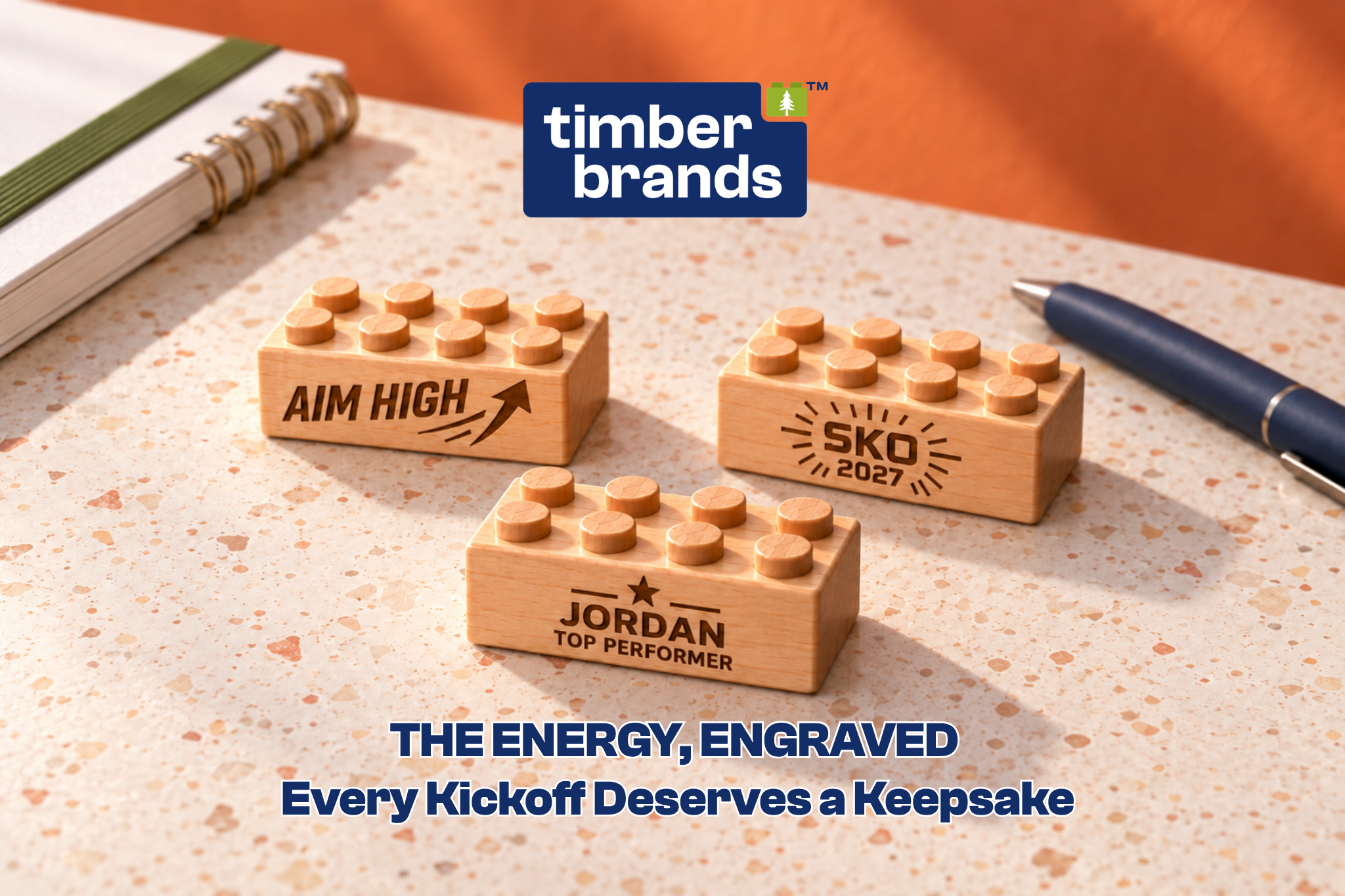
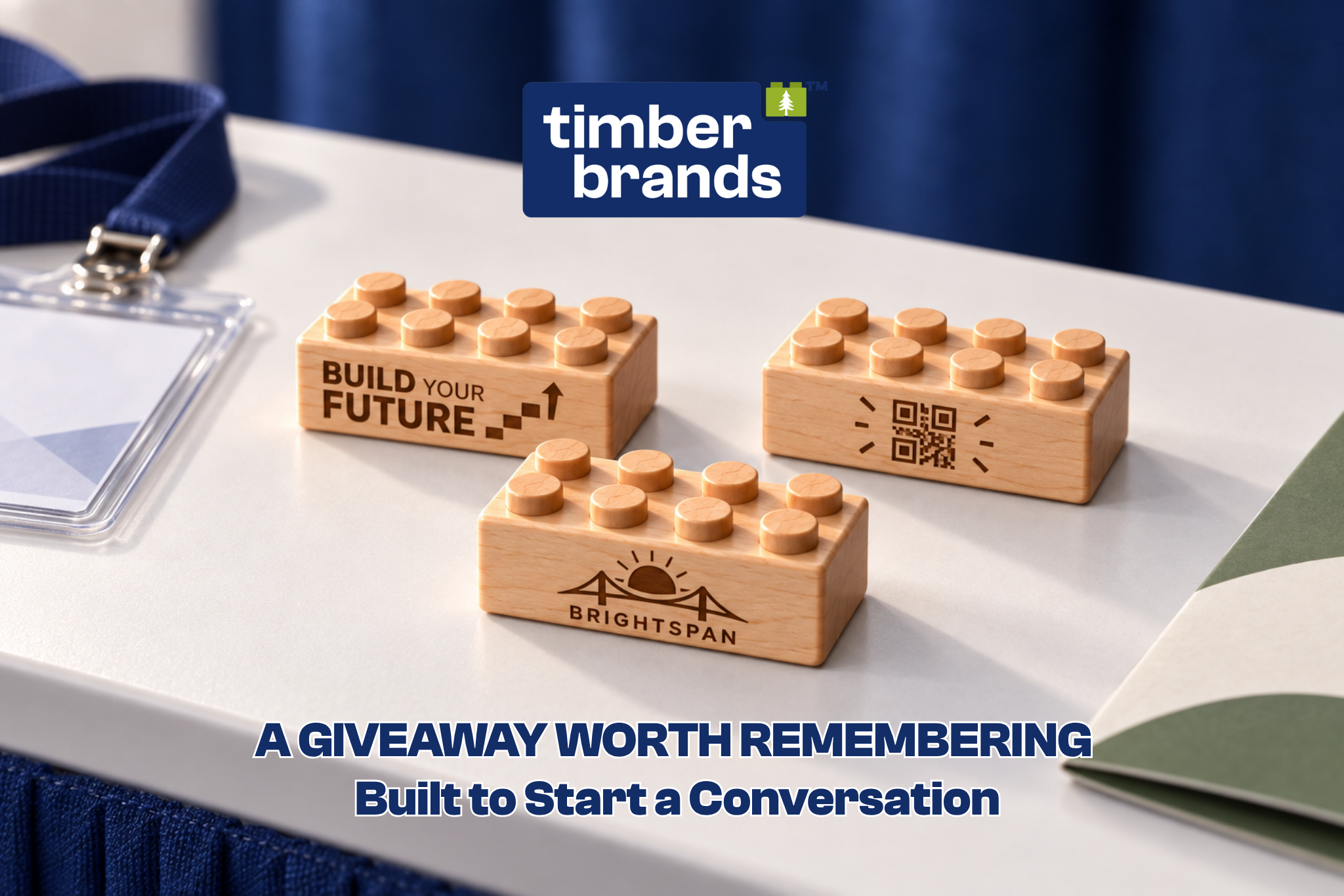
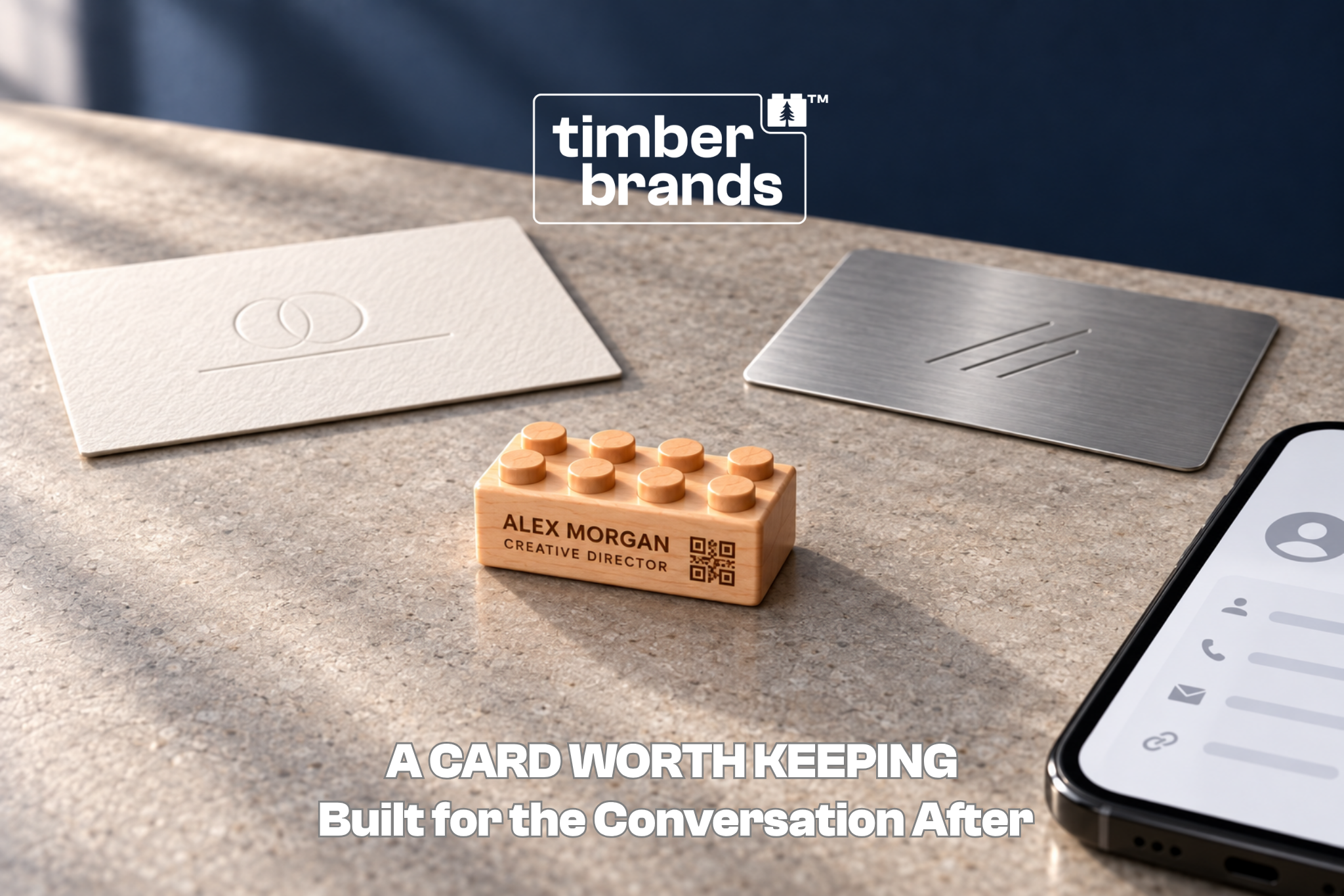
Every Timber Brick is engraved on its side faces rather than the studded top, which keeps the piece fully functional for stacking and building while still giving a design a clean, flat surface to sit on. This is worth keeping in mind early, since it means a design needs to work within a rectangular side panel rather than the square top surface people sometimes picture first.
Simplifying a Logo Before It Goes on Wood
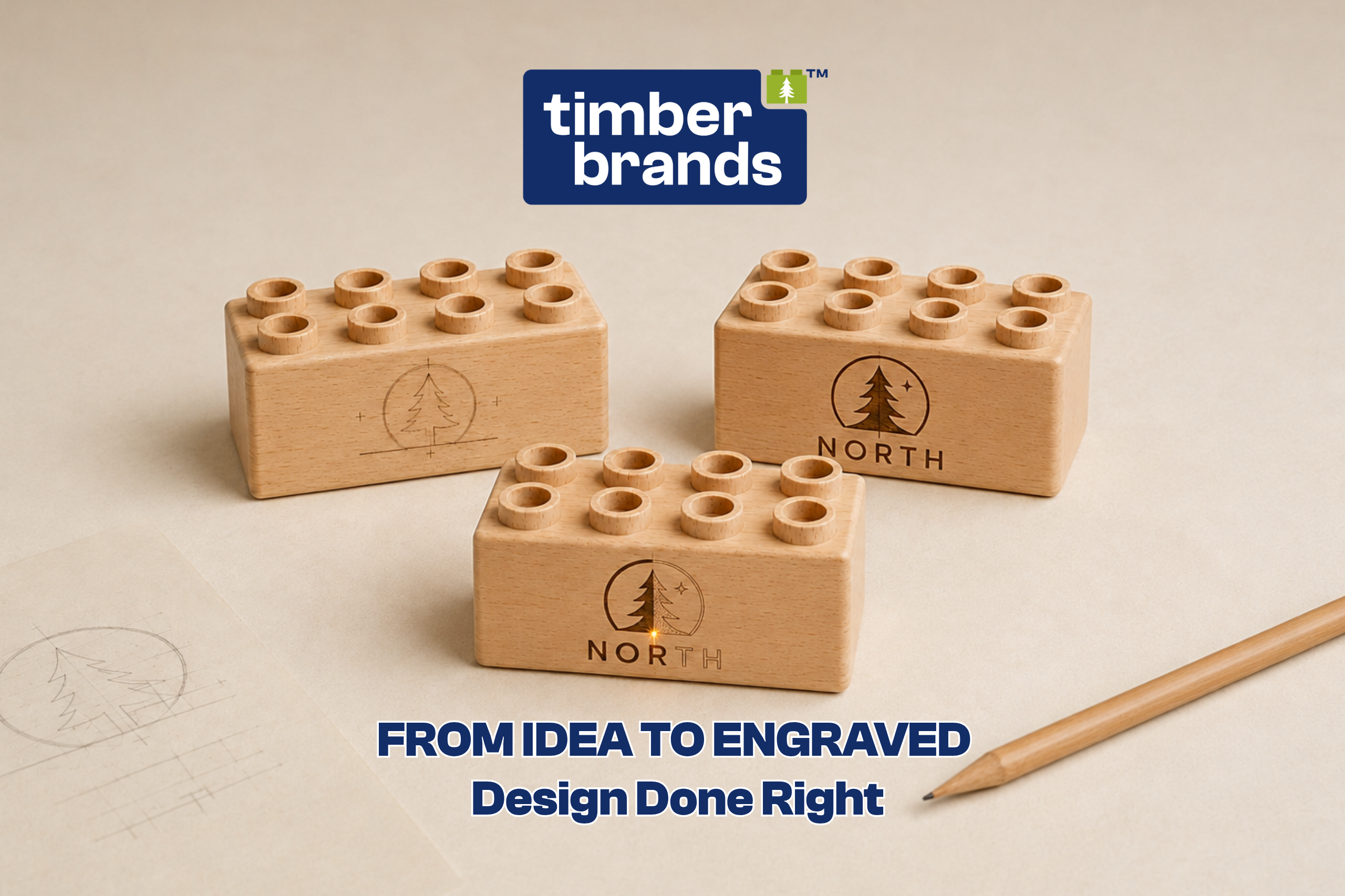
A logo built for a business card or a website often carries more detail than a small engraved surface can hold onto clearly. Fine gradients, thin overlapping lines, and small text within a logo tend to lose definition once scaled down and engraved. Simplifying a logo to its core shapes, and dropping any secondary detail that isn’t essential to recognizing it, almost always produces a cleaner result than trying to preserve every element of the original.
Line Weight and Contrast Matter More Than Color
Because engraving creates contrast through depth rather than color, a design with strong, clean lines and clear separation between elements engraves far more reliably than one built around subtle shading or color gradients. Timber Brands recommends a minimum line thickness of about 1 point for artwork, since thinner lines risk not engraving clearly or becoming difficult to read at a small scale.
Choosing a Font That Holds Up at Small Sizes
Not every font engraves well, particularly at the size a brick’s engraving area allows. Thin, decorative, or heavily stylized fonts tend to lose legibility once reduced, while bolder, simpler typefaces generally hold their shape more reliably. As a general guideline, Timber Brands recommends a minimum font size of about 6 points to keep text legible once engraved.
When a Message Needs to Get Shorter
Engraving space is limited by design, and a message that reads naturally in a sentence often needs to be trimmed down to fit cleanly on a brick. Cutting a message to its essential words, a name and a date, rather than a name and a full phrase, usually produces a more readable result than trying to shrink an entire sentence to fit.
Vector Artwork Produces the Cleanest Engraving
Vector files, like SVG, AI, or PDF formats, scale cleanly without losing detail, which makes them the preferred format for logos and custom artwork. Raster formats like PNG or JPEG are also accepted, provided they’re high-contrast and at least 300 DPI, but vector artwork generally gives a more precise, reliable result, especially for detailed logos.
Designing a Set That Feels Cohesive
When ordering multiple bricks meant to be displayed or used together, whether a themed gift set, a donor wall, or a class set, keeping the font, layout, and icon style consistent across every piece makes the finished set feel intentional rather than assembled from mismatched designs. Deciding on a shared visual approach before finalizing individual engravings saves a round of revisions later.
Reviewing a Proof Before It’s Final
Timber Brands’ 3D preview tool lets customers see exactly how a design will appear on the finished brick before an order is placed, which is worth using carefully rather than approving quickly. Checking spelling, spacing, and overall proportion at this stage catches issues that are far easier to fix on a screen than after a brick has already been engraved.
A Few Mistakes Worth Avoiding
A handful of design issues come up more often than others: text sized too small to read clearly, logos with too much fine detail for the engraving area, messages that run out of room mid-sentence, and designs that weren’t tested at the actual brick’s scale before submission. Most of these are avoidable simply by reviewing a proof at full size rather than judging a design from a zoomed-in screen view.
Preparing Files for a Custom Quote
Before requesting a custom quote, having a few things ready speeds up the process considerably: a vector file of any logo or artwork, the exact text to be engraved, a preferred brick size and quantity, and any specific placement preferences. For projects with more detailed technical questions, like exact engraving area dimensions for a specific brick, Timber Brands can confirm project-specific requirements directly.
A Design Process Built for a Physical Result
Timber Brands demonstrates that designing for engraving doesn’t need to be complicated, it just requires thinking about a design differently than one built for a screen. From choosing the right brick to preparing clean artwork, a little planning upfront produces a finished piece that looks intentional rather than improvised.
Start Designing Your Custom Brick:
Explore Custom Engraved Wooden Bricks
Contact Us to Get Started: sales@timberbrandsusa.com
For Immediate Assistance Call: +1 214 326 0130
Every engraved brick starts with a design built to last as long as the wood itself.
Frequently Asked Questions
Which brick size should be chosen before starting a design?
Standard 2×4 Wooden Bricks suit shorter names, dates, or compact logos. Plus 2×2 and Plus 2×4 Wooden Bricks offer more surface area for longer phrases or more detailed artwork.
Where is the engraving located on a Timber Brick?
Every brick is engraved on its side faces rather than the studded top, which keeps the piece fully functional for stacking and building.
What file format works best for a custom logo?
Vector files (SVG, AI, or PDF) scale cleanly without losing detail and are the preferred format. High-contrast raster files at 300 DPI or higher are also accepted.
Is there a minimum font size for engraved text?
Yes. Timber Brands recommends a minimum font size of about 6 points to keep text legible once engraved.
Can customers preview a design before ordering?
Yes. Timber Brands’ 3D preview tool shows exactly how a design will appear on the finished brick before the order is placed.
What should be ready before requesting a custom quote?
A vector file of any logo or artwork, the exact text to be engraved, a preferred brick size and quantity, and any placement preferences speed up the quote process.